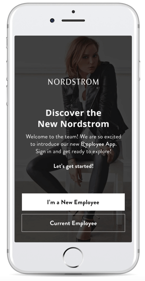
Digitally Transforming Nordstrom’s In-Store Salesforce
Nordstrom worked with Infor Hook & Loop Digital to explore the creation of a new in-store sales staff app to facilitate interactions with customers out-of-store, and to support ongoing personal development and product knowledge. Certain features and outcomes of this project influenced the rollout of the Nordstrom “Next” app which is now being used by the Nordstrom salesforce.

Responsibilities
Information Architect. I led the discovery, product feature definition, design scope and overall architecture, content and navigation of the application. I collaborated with a UI designer and strategist in client ideation sessions and building UI elements into the application.
Tools / Skills
• User research
• Client engagement
• Ideation workshops
• Information architecture
• Product design
• Service design
• User Journey Mapping
• Prototyping
Process

Discovery
Context & Challenges

Competitive Analysis & Market Research

Together with my team, we looked at a variety of popular products consumers use to shop online, consume and share fashion advice and service. This would help us understand customer needs and the context Nordstrom sales staff would need to address. These finding would later help define features and service experiences this app would ultimately enable.

User Insights


Ideation Session

We hosted two design thinking ideation sessions with client stakeholders to envision potential user journeys and customer experiences the new app could deliver. We ideated around 3 core themes (1) providing fashion expertise anytime, anywhere; (2) Digitally enable employees’ business and brand; (3) Support continuous employee learning and growth. These would later service as the narrative for illustrating app features and functionality in our designs.

Define
Product Goals

UX Goals

Challenges

Product FEatures
Taking into account the insights from user research and client ideation sessions, we agreed with the client to illustrate the following features in the application. Since this was a visionary project where we were asked not be restricted, we wanted to include and visualize a full spectrum of what this application could do and address user needs.

Technical Architecture
The employee app would require integration with several systems to acquire data needed to fuel the application. It would also require smart AI systems to learn and drive relevant content to users based on their interests and app usage (like social media). We ultimately defined that most the content would need to come from a HCM, CRM and PIM system to provide necessary product, customer, HR and educational content. Systems would also be required to subscribe to and bring in content from third-party sources such as fashion and news blogs. Finally there would need to be a content management system for a team to manage and push content such as company updates when needed. All this information would need to be aggregated and stored in a database for the app, where features around security, user management and single sign-on could be managed.

Develop
Navigation & Architecture
Based on the features we identified, I created a site map to illustrating the navigation and architecture of the application. This would help me define what screens we would need to design while also getting input and sign-off on the client before engaging in design effort.
User Flows
Based on the user journeys and product features defined, I crafted a series of flows demonstrating the flow of the app for various use cases. This would also help create a narrative to illustrate designs and features. I presented these to the client to get sign off before engaging in design effort.

Sketching
To formally kick off the design phase, I started by sketching out a series of key screens to experiment the placement and visualization of content. I did this together with my visual design team partner to brainstorm and bounce around ideas.

Wireframes
Following sketching exercises, I began designing medium fidelity wireframes to start defining page layouts, templates and content. I then laid these out in a series of wireflows to communicate the general flow and functionality of the application with the client. After sign-off, these were later passed to a visual designer who would define a unique UI and bring the application to life.

Wireflows
Taking the wireframes created I laid them out in a flow to illustrate the functionality of the application. These assets were used to present and get feedback from the client.

UI Design
The UI design was executed by my visual design partner. UI elements I wanted her to focus around were incorporating Nordstrom brand elements (since this was a Nordstrom product), and mixing it with common interactions and experiences like Instagram to make it feel more snackable. I also suggested Slack as a good example of mixing playfulness with professionalism, because this would ultimately be a work application. We did not want the app to be so serious that it would discourage users. My final suggestion was incorporating elements similar to Fit Bit since it is a good example of user experience for visualizing metrics.


Deliver
Service Design Video
In order to bring the application to life and visualize the new customer experiences the app could enable, I worked with a video team to tell the story behind a salesperson facilitating service remotely with the new app and bringing the customer into the store. While the production was executed by the video team, I helped put together the storyline, design assets and prototypes for the video.
Onboarding Style Quiz
When users first download and open the app, they will be prompted to take a style quiz to gather data around their interests and style tastes. This will allow the app to deliver more relevant content to their needs and match with customers with similar tastes when providing service.

Newsfeed
Similar to a newsfeed on social media, the Newsfeed feature provides the user with an aggregated feed of information on style, company updates, and customer updates. The Newsfeed will deliver content that is most relevant based on their historical browsing data and based on their interests indicated in the style quiz when setting up the app.
Product Discovery & Style Boards
The app features a “Collections” and “Product Discovery” section for the user to browse most recent product and styles, and to use as a canvas for curating different looks. Sales personnel can use these tools to enhance their knowledge on products, brands and styles, and to share different looks for their customers.


Sales Report & Customer Profiles
The app also features a sales report and customer profile section where users can get view their sales performance reports, as well as get a broad view of customer interests, trends and histories. These tools are designed to provide sales personnel with the information and metrics they need to build relationships with and identify best customers, as well as have a gauge to measure their performance and where they may need to improve.
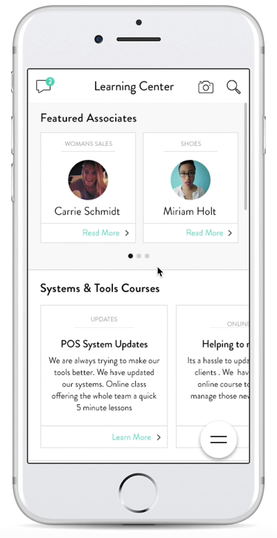
Learning Center & Groups
In order to encourage learning and mentorship, the app features a learning center and groups section where users can follow influencers, share blog posts, view training videos and join various interests groups. The goal is to foster a sense of community with snackable content for employees to feel supported and engaged.
Conclusions & Lessons Learned
This was a successful project that had a lot buy in from the client as well as my company’s management. The project received high praise and was also provided with additional resourcing with a video to bring the concepts to life. The outputs of the project ultimately helped drive features for a new employee app called “Next,” which was rolled out to staff members a year following this project.
This was personally a fantastic learning and growing experience where I had a lot of control around the creation and presentation of our ideas. I presented to VP members of the Nordstrom board, and worked directly with their technology staff in the creation of our concepts.